
Ted Low
I craft design systems that scale—and brands that shine.
Ted Low
I craft design systems that scale—and brands that shine.
Ted Low
I craft design systems that scale—and brands that shine.
About
About
Hey-o I’m Ted Low — a senior designer with over a decade of experience in design systems and branding.
I’m currently working on PENN Entertainment / theScore’s core design system Alley-oop, which covers industry leading brands such as ESPN BET, theScore, Hollywood Casino, and Penn on both mobile and web. Additionally, I work with a broad range of stakeholders on exploratory initiatives focusing on deepening our brand equity and connecting our apps and services with new partners.
Work
Work
Work
Alley-oop
Branding
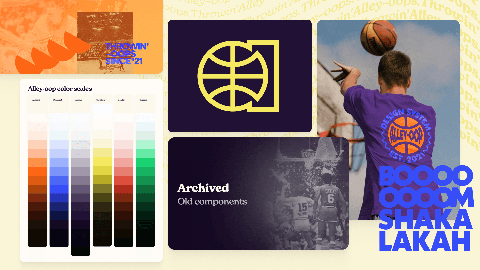
Problem: The Alley-Oop design system lacked a clear identity. It was seen as “all over the place,” had little brand presence in the organization, and many users didn’t recognize it as a product. It also didn’t reflect the team’s guiding principles.
Solution: I led the branding effort where I ran a workshop to define the team and product’s personality, refining the results into a cohesive brand. The goal was to create a brand we’d be proud to share, build trust with users, and give the design system a strong identity.
Results: Increased brand awareness and visual appeal both within and outside the team. The project delivered a logo, typography token system, color scales, semantic color tokens, presentation decks, graphic and image styles, Figma covers, a branded documentation site, and even team swag— strengthening pride and ownership in the design system.
Alley-oop
Branding
Problem: The Alley-Oop design system lacked a clear identity. It was seen as “all over the place,” had little brand presence in the organization, and many users didn’t recognize it as a product. It also didn’t reflect the team’s guiding principles.
Solution: I led the branding effort where I ran a workshop to define the team and product’s personality, refining the results into a cohesive brand. The goal was to create a brand we’d be proud to share, build trust with users, and give the design system a strong identity.
Results: Increased brand awareness and visual appeal both within and outside the team. The project delivered a logo, typography token system, color scales, semantic color tokens, presentation decks, graphic and image styles, Figma covers, a branded documentation site, and even team swag— strengthening pride and ownership in the design system.
Request portfolio deck ↗
Icons
Design Systems
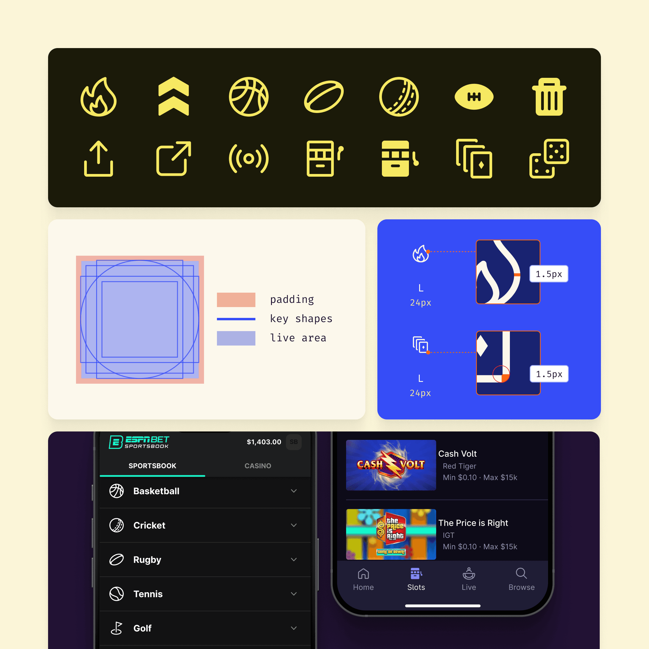
Problem: The icon library was scattered across multiple files, making it hard to navigate. The icon pipeline lacked flexibility for iconography. Icons were styled and sized inconsistently. Designers and developers often struggled to find the correct icons in the repositories.
Solution: I established clear guidelines for icon sizing, style, and padding ensuring consistency across the library. I also centralized the icon library for both designers and developers, making it easier to access and manage.
Results: The new system created a unified experience across platforms with consistent iconography. Developer inquiries about icon locations dropped by 64%. A new documentation site now provides clear guidelines for designers, and a single, centralized file with keywords attached to icon components keeps designers working efficiently without jumping between files.
Icons
Design Systems
Problem: The icon library was scattered across multiple files, making it hard to navigate. The icon pipeline lacked flexibility for iconography. Icons were styled and sized inconsistently. Designers and developers often struggled to find the correct icons in the repositories.
Solution: I established clear guidelines for icon sizing, style, and padding ensuring consistency across the library. I also centralized the icon library for both designers and developers, making it easier to access and manage.
Results: The new system created a unified experience across platforms with consistent iconography. Developer inquiries about icon locations dropped by 64%. A new documentation site now provides clear guidelines for designers, and a single, centralized file with keywords attached to icon components keeps designers working efficiently without jumping between files.
Request portfolio deck ↗
Hollywood Casino
Design systems

Problem: The newly rebranded Hollywood Casino needed a proper color system. The brand guidelines provided only primary brand colors, with no UI-friendly scales for accessibility and consistency.
Solution: I developed a full set of color scales—for background, action, danger, success, and warning colors—using an online color scale generator as a first pass and then tweaking them by hand. The goal was to create scales that maintained perceptual uniform brightness, ensuring usability while staying true to the brand.
Results: The new colors made the app more cohesive and visually distinct, This work contributed to the app climbing seven spots in the rankings, securing the #2 position among North American casino apps compared to the previous year.
Hollywood Casino
Design systems
Problem: The newly rebranded Hollywood Casino needed a proper color system. The brand guidelines provided only primary brand colors, with no UI-friendly scales for accessibility and consistency.
Solution: I developed a full set of color scales—for background, action, danger, success, and warning colors—using an online color scale generator as a first pass and then tweaking them by hand. The goal was to create scales that maintained perceptual uniform brightness, ensuring usability while staying true to the brand.
Results: The new colors made the app more cohesive and visually distinct, This work contributed to the app climbing seven spots in the rankings, securing the #2 position among North American casino apps compared to the previous year.
Request portfolio deck ↗